Designing a customizable dashboard
Background
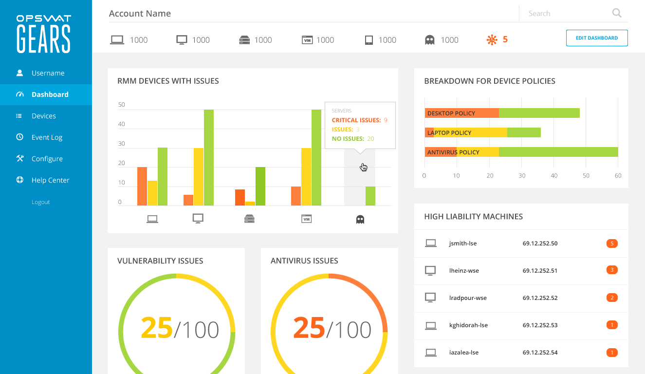
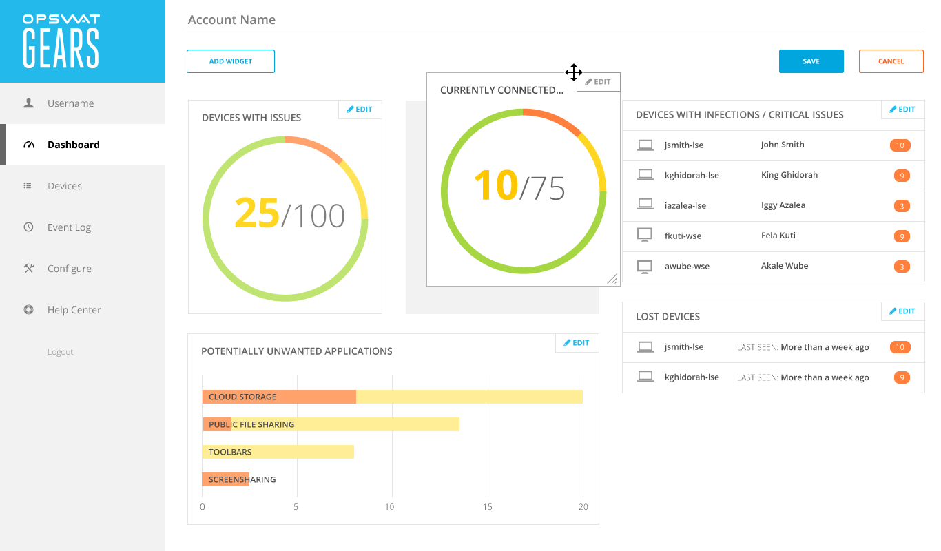
GEARS Cloud was an enterprise web application for monitoring devices on corporate networks.
Administrators would define security policies for networked devices, and the application would report back any issues. We had recently added new metrics for triaging devices and needed to update the dashboard to reflect this change.
Goal
Make the dashboard more useful for a broader set of administrators, especially those with atypical network topologies.
Role
In-house user experience designer
Designed the interaction pattern and user interface for dashboard customization.
Outcome
Administrators were able to personalize their dashboard metrics and layout, making it more actionable for their specific networks.
Process
- Reviewed known issues with the previous dashboard
- Mapped application data to meaningful visual representations
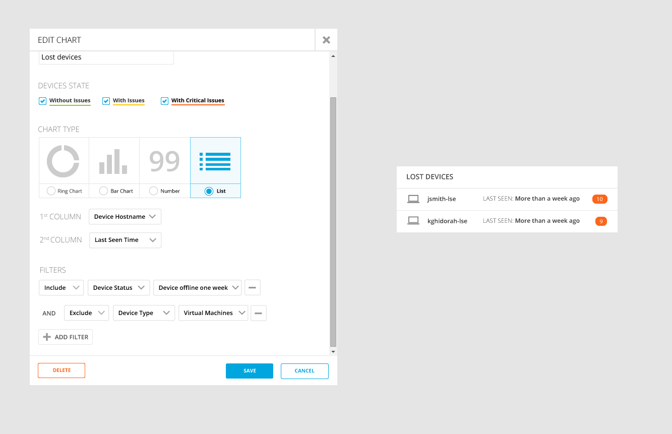
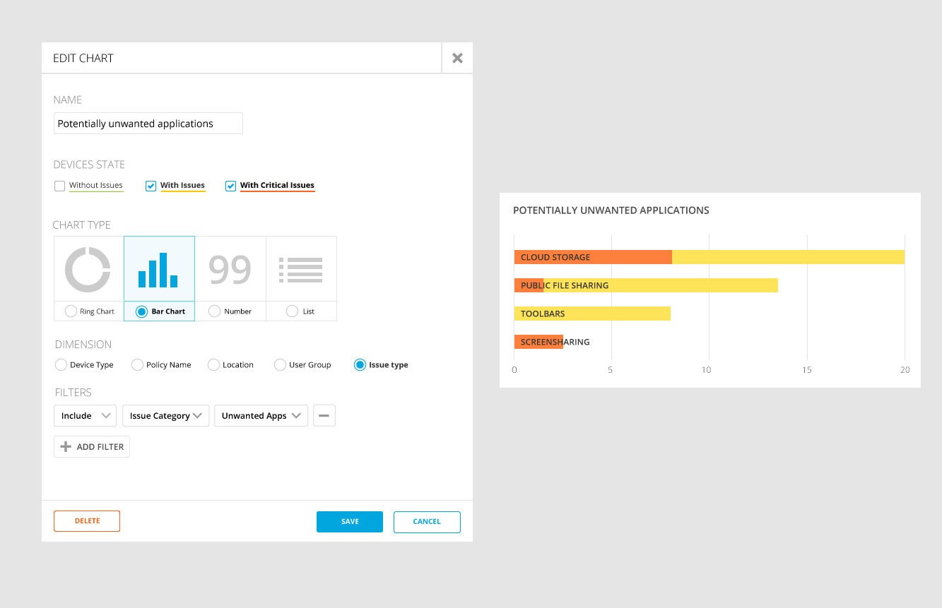
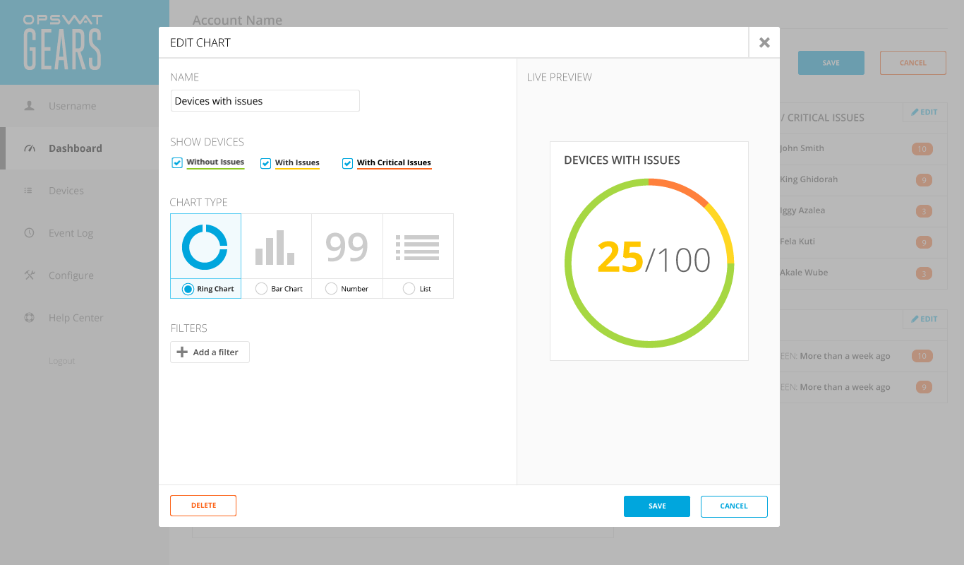
- Designed a modal window for configuring the visualizations
- Incorporated the configuration feature into the dashboard
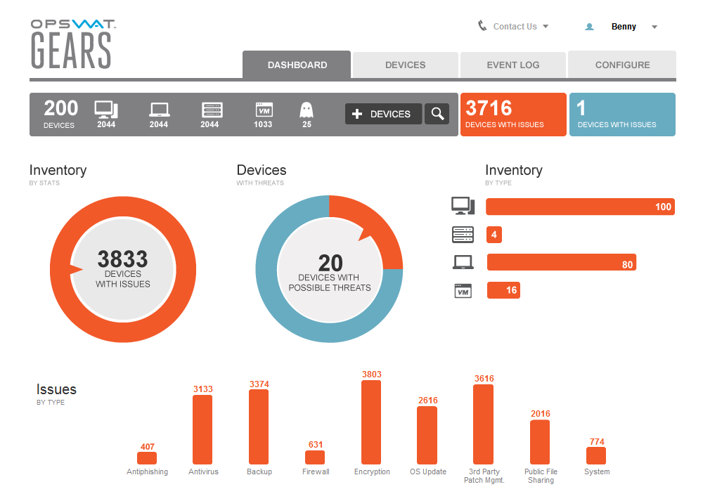
Known problems
Interviews had shown us that the dashboard wasn’t providing much utility for a large segment of our users. It had only been designed for one use case: a single network in an office building or on a small campus. Making the dashboard configurable would allow users to filter for user-generated compliance policies, groups, and locations.
Visualizing a solution
How could I align user goals with the database schema to create something useful?
The application recorded device information across three dimensions:
- Device type
- Device location
- Security policies
The metrics applied to these dimensions were:
- Number of issues
- Issue Severity
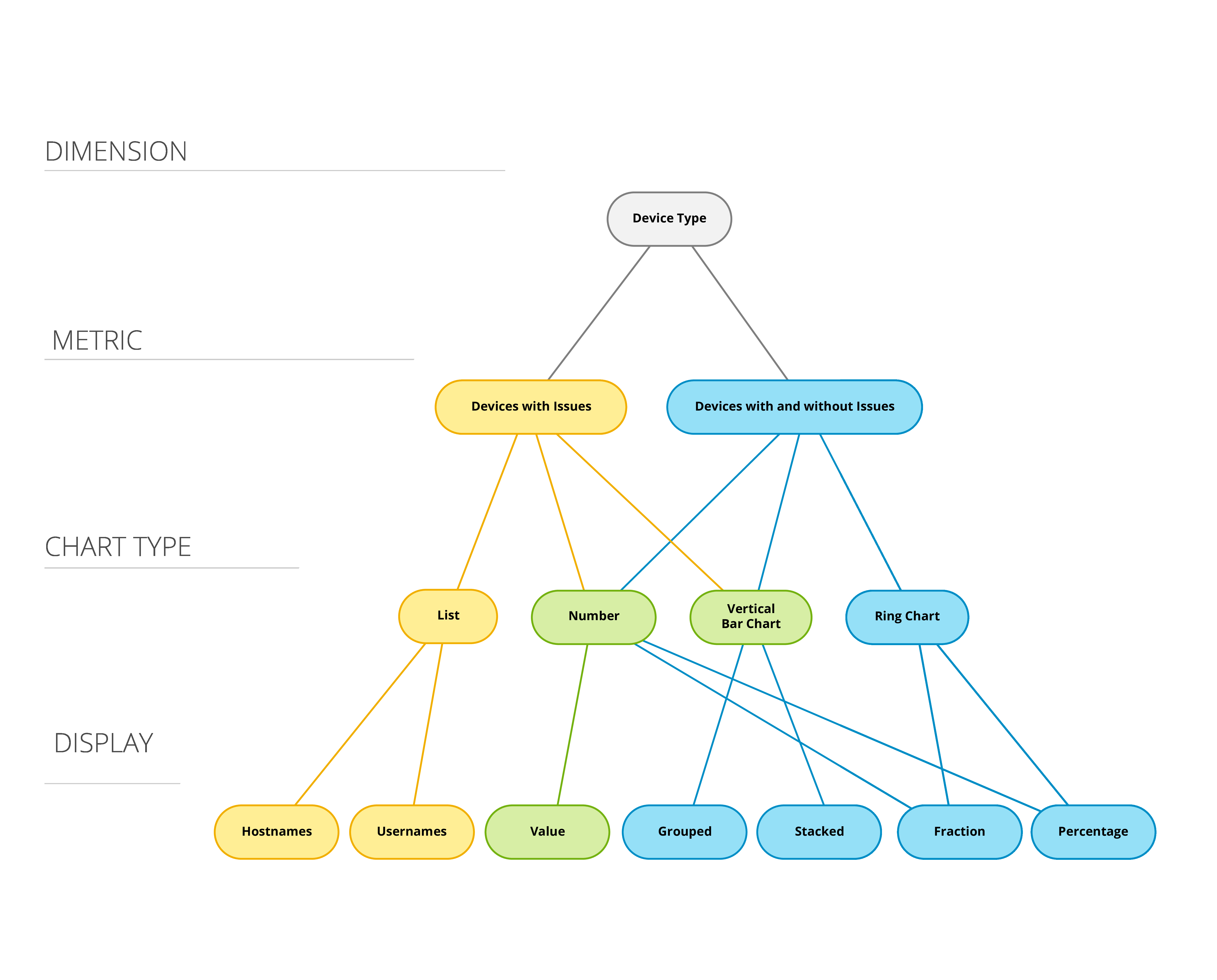
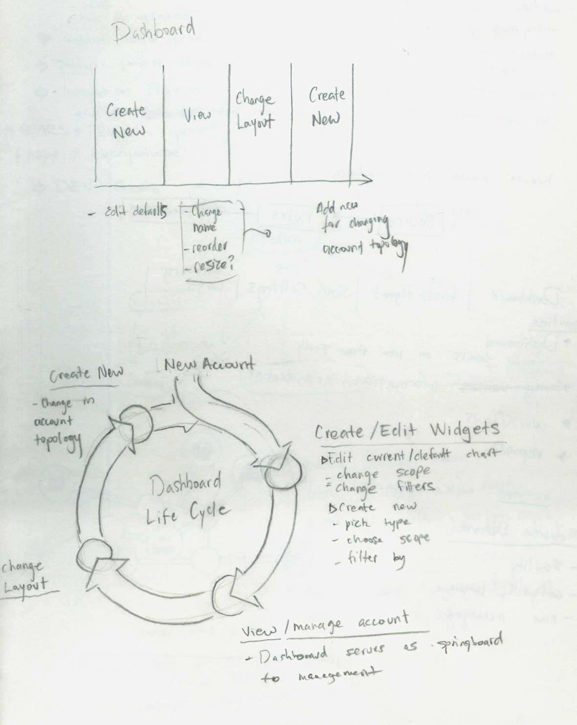
I created tree diagrams to map how application data could be represented visually. I then used the tree diagrams as a rubric for the controls in the modal editor.
Frequency of use
An important design consideration was how frequently administrators would configure the charts on their dashboard.
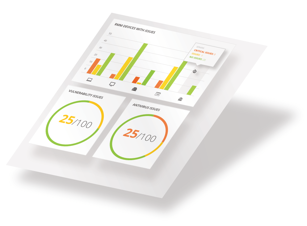
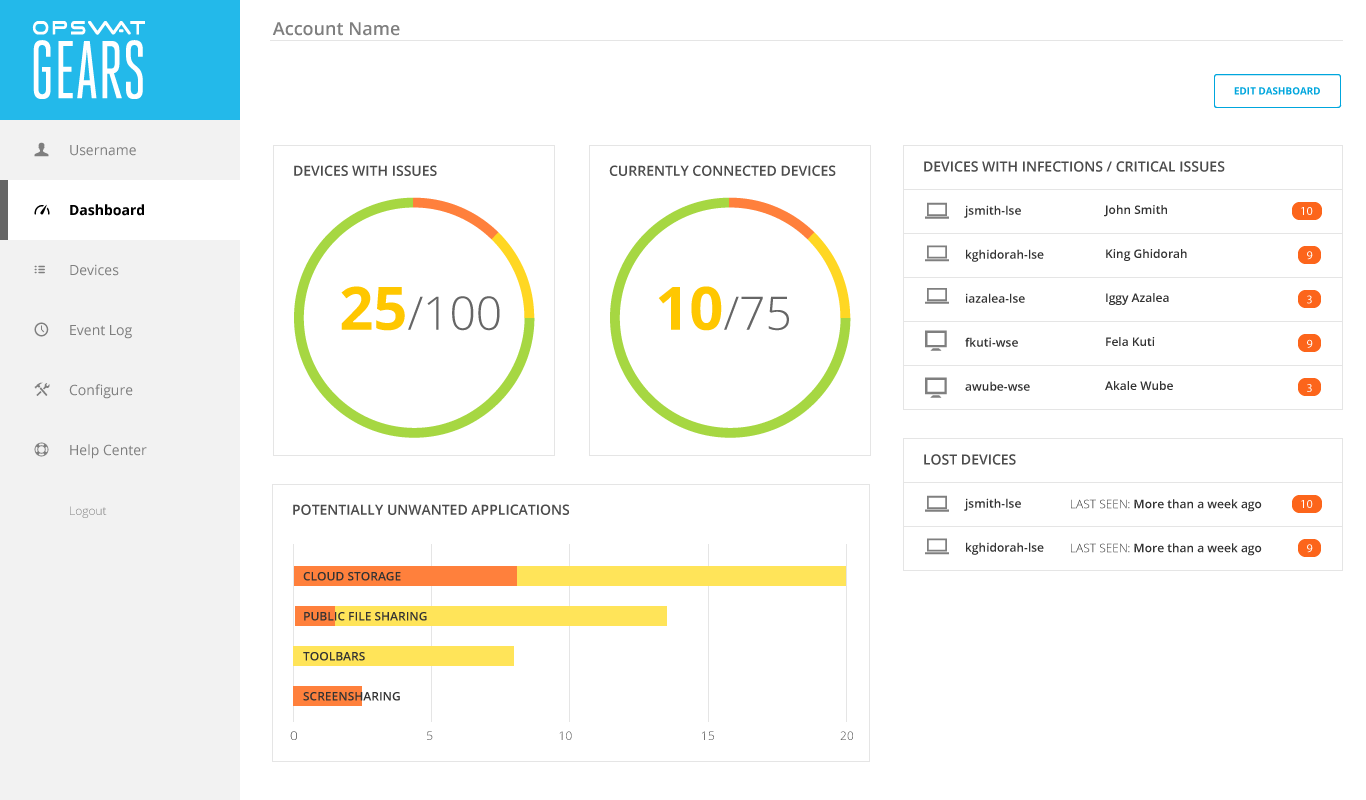
The primary use of the dashboard was to, all at once, give a bird’s eye view of the network while giving the administrator a way to effortlessly drill down into problematic devices.
I wanted to make sure that these actions remained prominent, while giving enough visual affordance to the chart configuration features.
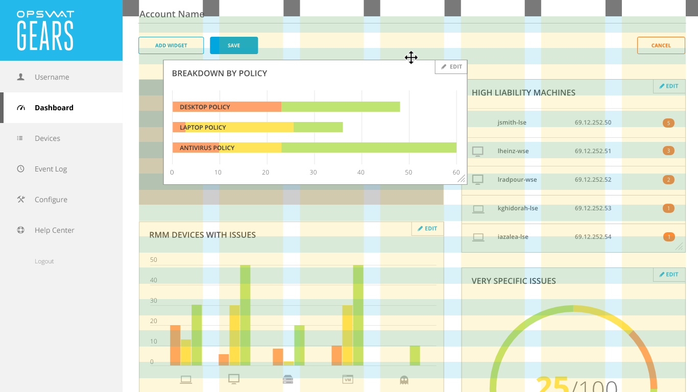
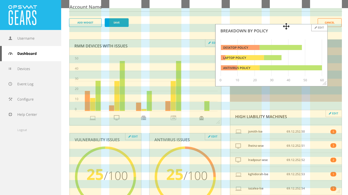
Modal editing
Configuration options were hidden behind an Edit Dashboard button. Designing this modality would safeguard against users accidentally moving the chart widgets when trying to click on chart elements. The colors would dim to cue users of the state change.
Customizing the layout
Chart widgets were designed to reflow based on a grid system, spanning either two, three, or four columns.
End result
My final design broke the dashboard into three modes:
Daily Use—using the dashboard as a springboard into devices that needed further investigation
Arrangement—moving the widgets around and resizing them.
Configuration—Editing chart widgets inputs through a modal window
The result was a highly configurable dashboard with an interface that was clean and goal-oriented.
Once all stakeholders had signed off on the user interaction, I cleaned up the visual style. In order to reduce visual clutter, I switched out the chart borders for a light gray background, and distinguished the left navigation by making it all one color.